Responsive Design is a fundamental concept in modern web development that ensures web content adapts to various screen sizes and devices.
The proliferation of mobile devices and their diverse screen sizes and resolutions have made the practice a fundamental consideration in web development.
The 4 Basic Principles of Responsive Design:
Mobile-First Approach
With mobile devices in mind, the design process progressively enhances the experience for larger screens, ensuring that content remains accessible on all devices.
Fluid Grids
Fluid Grids are layouts using relative units (percentages) rather than fixed units (pixels), allowing content to adapt to different screen sizes.
Flexible Images
Implementing images that scale proportionally without losing quality makes a consistent experience possible across all devices.
Media Queries
CSS media queries apply different styles or layout rules based on screen size, orientation, or other device-specific characteristics.

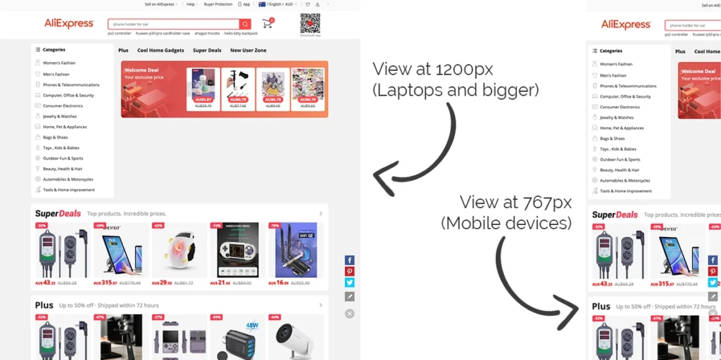
The image above is 2 screenshots of Ali Express, one of the world’s largest sites. The left image shows the site at 1200px (laptop screens and above). The right image shows how it looks at 767px (mobile devices).
Apart from the fact that the design could be considerably better regarding UX and UI considerations, the mobile version requires swiping and zooming to view the content.
What Can Be Done
Implementing a mobile-first approach requires a combination of UI and UX design principles, web development, and user testing.
The 4 Fundamental Strategies of Mobile-First Approach:
Content Prioritisation
Prioritising essential content for above the fold on mobile devices and progressively enhancing the experience for larger screens.
Frameworks:
Utilising responsive CSS frameworks like Bootstrap or Foundation that provide pre-built components and responsive grid systems ensures websites are fail-safe on all common web browsers.
Layout Techniques
Modern layout techniques like CSS Flexbox and Grid natively create flexible and responsive designs.
Testing and Debugging
Rigorous testing across various devices and browsers ensures a seamless user experience.
Significance of Responsive Design
Responsive Design presents several compelling advantages:
Improved User Experience
Users can access and interact with content on any device, resulting in a more positive user experience.
SEO
Google’s mobile-first indexing prioritises responsive websites, improving search engine rankings. Read SEO: How To Beat Your Rivals in the SERPs Race for an in-depth look at SEO as a whole.
Cost Efficiency
A Responsive Design approach reduces the need for separate mobile and desktop websites, saving time, money and resources.
Future-Proofing
With the ever-evolving landscape of devices and screen sizes, Responsive Design is essential for future-proofing websites.
The Future of Responsive Design
As technology evolves, a mobile-first approach will remain a cornerstone of web development. However, new challenges are emerging, such as optimising for emerging technologies like wearable devices and smart TVs. Additionally, designers and developers must address performance optimisation and accessibility concerns to ensure a holistic user experience.
Conclusion
Responsive Design is a fundamental concept in modern web development that allows web content to adapt to diverse devices and screen sizes.
By adhering to fundamental principles and employing appropriate implementation strategies, web designers and developers can create user-friendly, accessible, and future-proof websites.
A History Foot Note
Responsive Design has roots in the early 2000s, but it gained significant attention and widespread adoption after Ethan Marcotte’s seminal book “Responsive Web Design” in 2010. Marcotte’s article introduced the concept of fluid grids, flexible images, and media queries as the foundational elements. These concepts laid the groundwork for a more user-centric and device-agnostic web.